CIA Cartography Center has been making vital contributions to our Nation’s security, providing policymakers with crucial insights that simply cannot be conveyed through words alone.
1980 Central Moscow Map
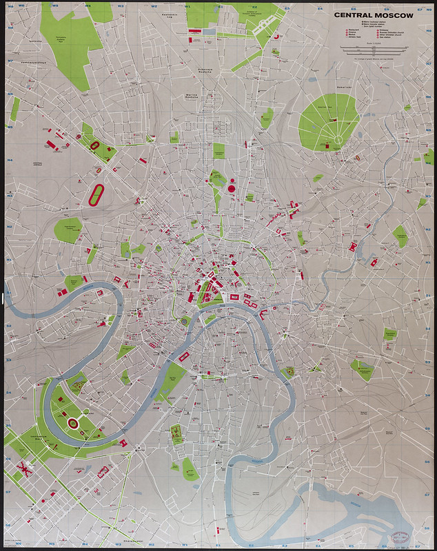
This 1980 CIA map of Moscow is a detailed urban intelligence map focused on the center of the Soviet capital during the late Cold War.
Unlike many general reference maps, this one was designed for strategic and operational use, highlighting transportation networks, government buildings, parks, rail infrastructure, embassies, and important public facilities.
The map uses a highly organized grid system and color coding:
- red marks major government, diplomatic, military, and public buildings,
- green highlights parks and open spaces,
- blue traces the Moskva River and waterways,
- while the dense street and rail patterns emphasize Moscow’s importance as the political and transportation hub of the Soviet Union.
At the center is the Kremlin area, shown in great detail as the core of Soviet political power. Around it are major boulevards, rail terminals, metro lines, stadiums, and administrative districts. The circular road layout reflects Moscow’s historic growth outward from the Kremlin through successive ring roads.
By 1980, Moscow was under intense scrutiny from Western intelligence agencies.
The city hosted the 1980 Summer Olympics during a period of heightened Cold War tension following the Soviet invasion of Afghanistan in 1979. CIA maps like this would have been useful for diplomatic security planning, intelligence analysis, and understanding the geography of Soviet government operations.
The clean graphic design is characteristic of late Cold War CIA cartography.
Rather than artistic relief shading seen in earlier maps, this style focused on clarity, precision, and rapid interpretation. E
very rail yard, roadway, and public site could hold intelligence value, especially in a closed society like the USSR where reliable geographic information was often difficult for outsiders to obtain.
Historically, the map represents the mature phase of Cold War intelligence mapping: highly technical, data-rich, and optimized for analysts, diplomats, and policymakers monitoring one of the world’s most important strategic capitals.
Also see: European Countries With A Population Less Than The Moscow Metropolitan Area
1981 Yugoslavia Map
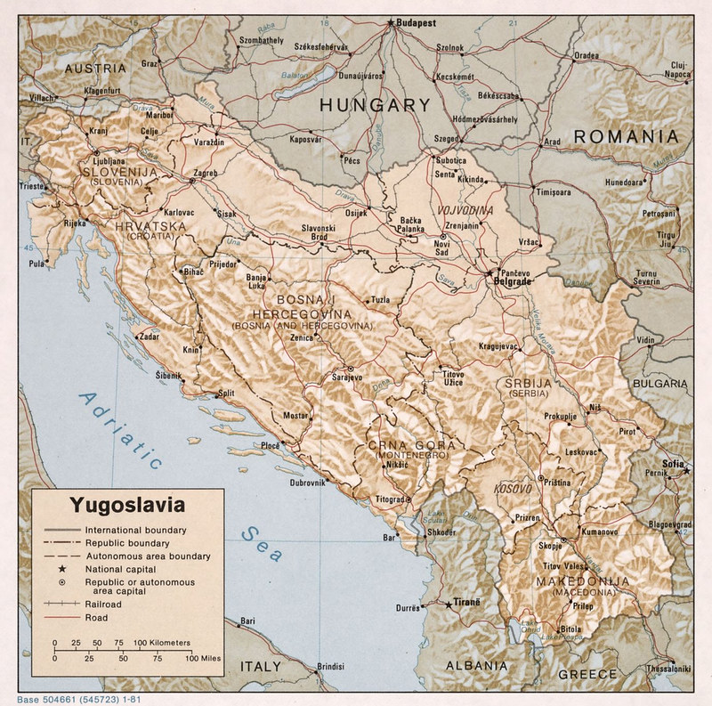
This 1981 CIA map of Yugoslavia shows the complex internal structure of the multinational Yugoslav federation during the late Cold War.
The map highlights the country’s six republics: Slovenia, Croatia, Bosnia and Herzegovina, Serbia, Montenegro, and Macedonia, along with the autonomous provinces of Kosovo and Vojvodina inside Serbia.
The map emphasizes transportation routes, railroads, mountainous terrain, and administrative borders, reflecting Yugoslavia’s strategic importance as a non-aligned state positioned between the Soviet bloc and Western Europe.
Major cities such as Belgrade, Zagreb, Sarajevo, Skopje, and Ljubljana are clearly marked, along with connections to neighboring countries including Italy, Austria, Hungary, Romania, Bulgaria, Greece, and Albania.
Physically, the map shows how rugged geography shaped the region. Mountain ranges dominate Bosnia, Montenegro, and much of southern Yugoslavia, while flatter plains appear in northern Serbia and Vojvodina along the Danube River basin.
These geographic divisions often overlapped with ethnic and political boundaries, something intelligence analysts closely monitored.
The timing of the map is historically important.
It was produced shortly after the death of Josip Broz Tito in 1980. Tito had held Yugoslavia together through a balance of regional autonomy and centralized communist rule.
By 1981, Western intelligence agencies were increasingly concerned about whether ethnic tensions, nationalism, and economic problems might destabilize the federation after his death.
In retrospect, the map captures Yugoslavia during its final decade as a unified country before the violent breakup of the 1990s. Many of the republic and provincial borders shown here later became international front lines during the Yugoslav Wars.
Like many CIA reference maps from the era, the design combines topographic detail with political organization, creating a product useful for diplomats, military planners, and intelligence analysts studying one of the Cold War’s most geopolitically sensitive regions.
Also see: Animated Map Of The Breakup of Yugoslavia 1989 – 2008
1982 Jordan Water Development Map
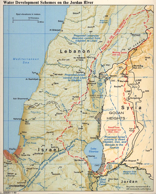
This 1982 CIA map of the Jordan River focuses on competing water development projects and regional control of water resources involving Israel, Lebanon, Syria, and Jordan.
Rather than emphasizing politics alone, the map shows how strategic access to rivers, tributaries, dams, and canals shaped regional tensions.
The map traces the upper Jordan basin, including the Hasbani, Banias, and Dan rivers, which are critical headwaters feeding into the Jordan River and the Sea of Galilee (Lake Tiberias).
It highlights proposed Israeli, Lebanese, and Syrian diversion projects, along with existing infrastructure such as Israel’s National Water Carrier and Jordan’s East Ghor Canal.
The red dashed outline marks the basin of the upper Jordan watershed, emphasizing how snowmelt from Mount Hermon and seasonal rainfall supplied water to multiple states.
The map also shows the disputed and militarized geography of the region, including the Golan Heights, demilitarized zones, cease-fire lines, and UN-monitored areas.
Produced in 1982, the map reflects a period when water security was considered a major geopolitical issue in the Middle East.
Control of water resources had already contributed to tensions before the Six-Day War, and by the early 1980s the issue remained deeply connected to military strategy, agriculture, settlement policy, and regional diplomacy.
Unlike many Cold War CIA maps focused purely on military forces, this one demonstrates the Agency’s growing interest in environmental and infrastructure intelligence.
Water availability was recognized as a strategic resource capable of influencing economic development, population growth, and political stability.
The map’s detailed hydrological and topographic presentation also shows how CIA cartographers combined physical geography with political boundaries to explain complex regional disputes in a clear visual format for policymakers and analysts.
Also see: Map Of Jordan Created By The CIA
1982 Pakistan Afghan Refugees Map
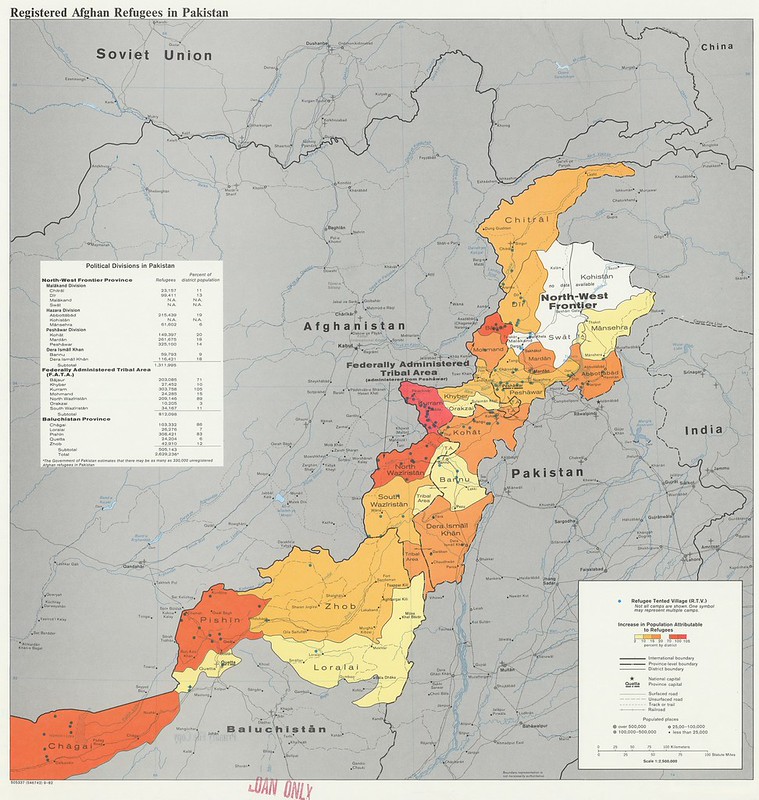
This 1982 CIA map of Pakistan shows the distribution of registered Afghan refugees who fled into Pakistan during the Soviet–Afghan War.
The map highlights refugee concentrations by district, especially along the Afghan-Pakistani border in the North-West Frontier Province (now Khyber Pakhtunkhwa) and Baluchistan.
Color shading represents the percentage increase in local population caused by refugee arrivals, with some frontier districts experiencing increases of more than 100 percent.
Blue dots mark refugee villages and camps, many clustered near Peshawar, Kohat, Quetta, and the tribal regions bordering Afghanistan.
The map also identifies Pakistan’s administrative divisions, transportation routes, and population centers, showing how refugee settlements spread along key roads and frontier areas.
The heaviest refugee presence appears in tribal and border districts such as Kurram, North Waziristan, South Waziristan, Chitral, and Pishin.
Produced during the early years of the Soviet occupation of Afghanistan, the map reflects one of the largest refugee crises of the Cold War.
Millions of Afghans fled conflict, bombing, and political repression, with Pakistan becoming the primary refuge for displaced civilians and resistance fighters linked to the Afghan mujahideen.
Beyond humanitarian concerns, the map had major strategic importance for U.S. intelligence and policymakers. Refugee camps near the border often became centers for aid distribution, political organization, and recruitment connected to anti-Soviet resistance efforts supported by Pakistan, the United States, Saudi Arabia, and others.
The map demonstrates how CIA cartographers combined demographic, political, and geographic information to visualize the regional impact of war.
Rather than focusing solely on military operations, it illustrates how population displacement reshaped border regions and affected the political and economic stability of neighboring Pakistan during the 1980s.
Also see: The First Proposed Map of Pakistan & The Partition of India
1984 Vatican City Map
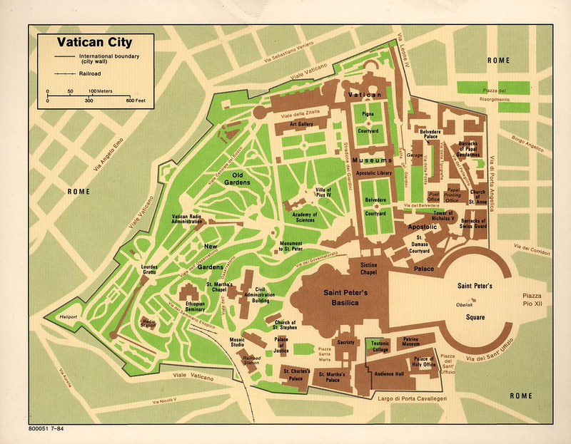
This 1984 CIA map of Vatican City provides a detailed layout of the world’s smallest sovereign state, centered on the religious and administrative heart of the Catholic Church.
The map shows the boundaries of Vatican City within Rome and highlights major buildings, courtyards, gardens, and institutions inside the walled enclave.
Key landmarks include Saint Peter’s Basilica, Saint Peter’s Square, the Apostolic Palace, the Sistine Chapel, the Vatican Museums, and the Vatican Gardens.
Administrative and ceremonial locations such as the Swiss Guard barracks, audience halls, libraries, and papal residences are also marked in detail.
Unlike broader political or military maps produced by the CIA during the Cold War, this map focuses on infrastructure, internal organization, and navigation.
It reflects the intelligence community’s interest in important diplomatic and religious centers, particularly one with major global influence despite its tiny geographic size.
The map’s clean design and careful labeling suggest it was intended for briefing, orientation, or reference purposes.
Roads, rail access, courtyards, and entrances are clearly identified, giving a functional overview of how Vatican City is arranged spatially within the surrounding city of Rome.
Created during the papacy of Pope John Paul II, the map also reflects the Vatican’s importance in international affairs during the 1980s.
The Holy See played a significant diplomatic role in Cold War politics, especially in Eastern Europe and Poland, making Vatican City an important location for U.S. intelligence awareness and monitoring.
Also see: Vatican City Railway: World’s Shortest National Rail System and The Height of Burj Khalifa vs Vatican City
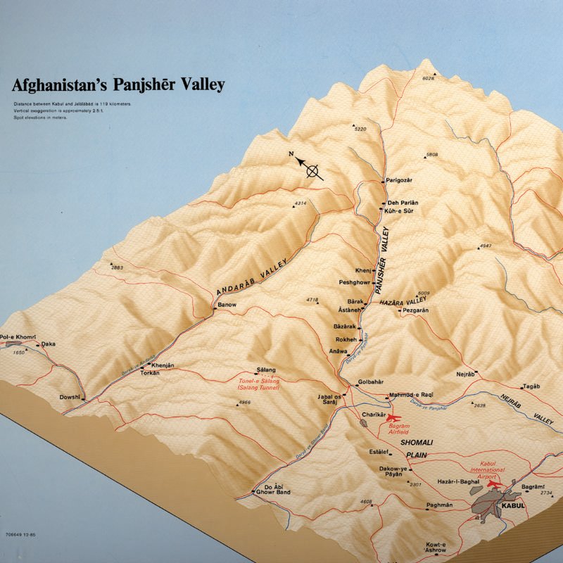
1985 3D Afghanistan Panjsher Valley Map
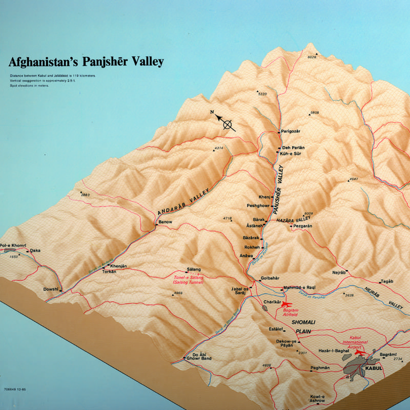
This 1985 CIA map of Panjshir Valley uses a three-dimensional shaded-relief style to emphasize the rugged mountain terrain and narrow valleys that made the region strategically important during the Soviet–Afghan War.
The map highlights roads, rivers, villages, mountain passes, and elevation points around the Panjshir Valley north of Kabul.
Key locations include the Salang Tunnel, Bagram Airfield, Kabul, Charikar, and villages throughout the valley system.
The map also traces routes through the Andarab and Hazara valleys, showing how the Panjshir connected to major transportation corridors between northern and central Afghanistan.
The dramatic terrain depiction explains why the valley became one of the strongest resistance centers against Soviet forces.
Steep mountains, narrow access routes, and isolated settlements gave Afghan mujahideen fighters major defensive advantages against armored columns and air assaults.
The Panjshir Valley was closely associated with resistance commander Ahmad Shah Massoud, whose forces repeatedly resisted large Soviet offensives during the 1980s.
Unlike conventional political maps, this map focuses heavily on topography and mobility.
Roads, passes, and valleys are emphasized because movement through the Hindu Kush mountains was central to military planning, supply operations, and intelligence analysis. The use of shaded relief gives the map an almost physical-model appearance, helping viewers quickly understand elevation changes and geographic barriers.
The map reflects how CIA cartography during the Afghan war increasingly combined detailed terrain visualization with operational intelligence.
Such maps were valuable for analyzing guerrilla warfare, Soviet troop movement, and the logistical challenges of fighting in Afghanistan’s mountainous landscape.
Also see: Iran’s Size Compared To 5 Other Countries The US Has Invaded
1987 Korean Peninsula Map
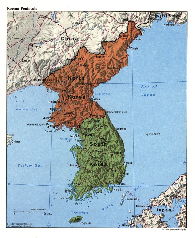
This 1987 CIA map of the Korean Peninsula shows the political division between North Korea and South Korea during the late Cold War.
The map emphasizes the heavily militarized Demarcation Line separating the two states, along with major cities, transportation routes, and mountainous terrain across the peninsula.
North Korea is shaded in brown and South Korea in green, visually reinforcing the peninsula’s division after the Korean War.
Important cities such as Pyongyang, Seoul, Pusan, Kaesong, Wonsan, and Chongjin are marked, while neighboring countries including China, the Soviet Union, and Japan appear along the edges of the map to show the peninsula’s strategic regional position.
The map’s shaded-relief style highlights Korea’s rugged geography, especially the mountains that dominate much of both countries.
Roads, railroads, ports, and coastal access points are clearly identified, reflecting the military and logistical importance of transportation networks in a region considered one of the world’s major Cold War flashpoints.
Produced in 1987, the map reflects a period of continuing tension between the communist North and the U.S.-allied South.
American intelligence agencies closely monitored the peninsula because of North Korea’s military posture, Soviet and Chinese influence, and the large U.S. military presence in South Korea.
Rather than focusing on detailed military deployments, the map provides a broad strategic overview of the peninsula’s geography and political boundaries.
It demonstrates how CIA cartography combined terrain, infrastructure, and geopolitical information to support policymakers and analysts dealing with East Asian security issues during the final years of the Cold War.
Also see: Map of The Korean War In 60 Seconds & North Korea vs South Korea GDP Per Capita In 1970 vs 2023
1988 Tanzania Transport Map
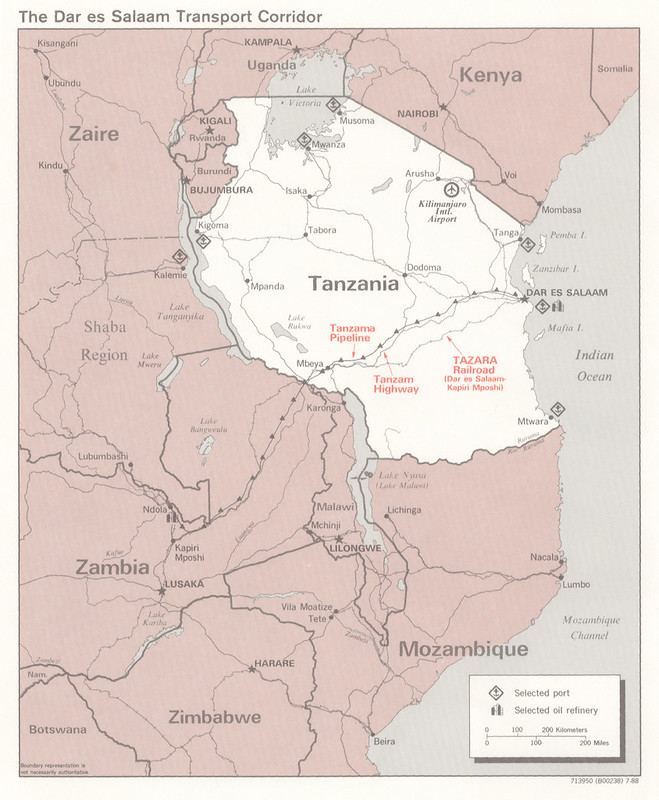
This 1988 CIA map of the Tanzania highlights the Dar es Salaam transport corridor and its importance as a regional trade and transportation network in south-eastern Africa.
The map traces major infrastructure routes linking Tanzania’s Indian Ocean coast with inland countries including Zambia, Malawi, Mozambique, and parts of central Africa.
Key transportation systems are emphasized in red, including the TAZARA Railway connecting Dar es Salaam to Kapiri Mposhi in Zambia, the Tanzam Highway, and the Tanzama oil pipeline.
Ports, oil refineries, and selected transportation hubs are also marked, showing how goods and resources moved between the coast and the interior.
The map reflects the strategic importance of Dar es Salaam as one of East Africa’s major export and import gateways during the late Cold War.
For landlocked Zambia in particular, these transport links provided an alternative route to the sea that bypassed apartheid-era South Africa and conflict zones in southern Africa.
Neighbouring countries and regional connections are shown to place Tanzania within a wider political and economic network stretching across eastern and southern Africa. Railroads, highways, lakes, and border corridors demonstrate how geography shaped trade and regional cooperation.
Produced in 1988, the map illustrates how CIA cartography often focused on infrastructure and economic systems rather than just military concerns.
Transportation corridors like TAZARA had geopolitical significance because they influenced trade, regional alliances, energy supply, and foreign influence in Africa during the Cold War.
The map combines political boundaries with strategic infrastructure to provide a clear overview of how transportation connected the region.
Also see: Air Tanzania Flight Route Destinations Map
CIA Terrain Process Photos
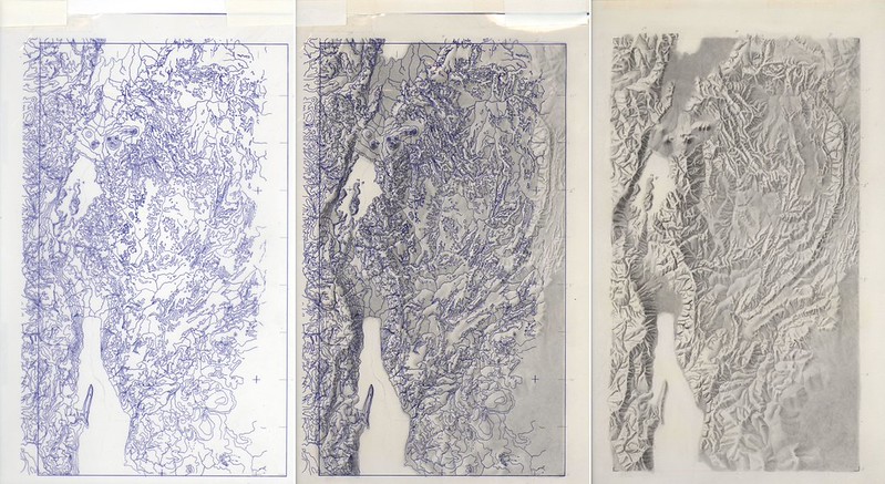
These CIA terrain-process photographs show different stages in the creation of shaded-relief and three-dimensional terrain maps during the Cold War era.
The sequence moves from technical contour-line drafts on the left to a finished raised-relief terrain model on the right, demonstrating how cartographers transformed raw elevation data into visually realistic geographic imagery.
The first image appears to show a dense topographic contour map, where elevation is represented through tightly packed lines.
The middle image adds tonal shading and texture, helping define mountain ridges, valleys, and slopes more clearly. The final panel presents a sculpted relief rendering that resembles a physical terrain model photographed under directional lighting to emphasize elevation and landforms.
This process was important for CIA cartography because terrain visualization played a major role in military planning, intelligence analysis, and geographic briefing materials.
Relief maps allowed analysts and policymakers to quickly understand mountain barriers, transportation corridors, river valleys, and strategic terrain features that might be difficult to interpret from standard contour maps alone.
The techniques shown here were especially useful for mapping rugged regions such as Afghanistan, the Korean Peninsula, the Andes, or the Himalayas, where terrain heavily influenced warfare, logistics, and political boundaries.
Before modern digital GIS and satellite-based 3D modeling became widespread, these relief-production methods combined manual drafting, photomechanical reproduction, and physical modeling techniques.
The photographs also highlight the craftsmanship behind CIA mapmaking during the Cold War.
Many intelligence maps were not only analytical tools but also carefully designed visual products intended for senior government officials, military planners, and presidential briefings.
The progression from technical linework to realistic relief demonstrates how intelligence cartographers blended science, geography, and artistic technique to produce highly detailed terrain visualizations.
Also see: XKCD Explains The Cause Of Landscape Features Of The United States
Indonesia Oil & Gas Map
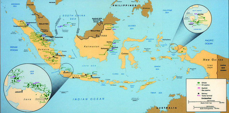
This CIA map of Indonesia from the 1980s highlights the country’s major oil and natural gas infrastructure across its vast island chain.
The map identifies oilfields, gas fields, pipelines, refineries, and tanker terminals stretching from Sumatra and Java to Kalimantan, Sulawesi, and western New Guinea.
Green symbols mark oilfields and pipelines, while pink symbols indicate gas fields and gas pipelines.
Insets around Jakarta and western New Guinea provide enlarged views of especially dense energy-production areas. Major refining and export centers are shown near cities such as Balikpapan, Palembang, Jakarta, and other coastal hubs connected to international shipping routes.
The map demonstrates Indonesia’s importance as one of the leading energy producers in Asia during the late Cold War period.
Oil and gas exports were central to the Indonesian economy and strategically important to global energy markets, especially after the oil crises of the 1970s.
Maritime chokepoints such as the Strait of Malacca and Makassar Strait are prominently positioned, emphasizing Indonesia’s role in regional shipping and resource transport.
Produced for intelligence and strategic analysis, the map focuses less on political boundaries and more on economic geography and industrial infrastructure.
By mapping extraction sites alongside pipelines and export terminals, CIA analysts could assess production capacity, transportation networks, and the vulnerability of energy systems across the archipelago.
The map also reflects the logistical challenges of governing and developing an island nation spread across thousands of islands. Energy resources are widely dispersed, requiring extensive maritime transport and pipeline systems to connect production zones with refineries and export facilities.
Overall, the map is a strong example of how CIA cartography in the 1980s increasingly emphasized economic intelligence and global resource networks in addition to traditional military and political concerns.
Also see: 1 In 50 People In The Whole World Live On This Island
President Ronald Reagan CIA Map
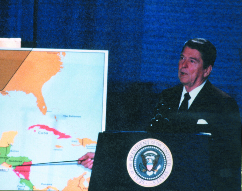
This photograph shows Ronald Reagan delivering a public presentation using a large CIA-produced map focused on Central America and the Caribbean during the early 1980s.
The highlighted countries, including Nicaragua, Honduras, El Salvador, and Cuba, reflect one of the most important Cold War flashpoints of Reagan’s presidency.
The map was likely used during speeches or televised briefings explaining U.S. policy toward communist influence in the Western Hemisphere.
During this period, the Reagan administration argued that Soviet- and Cuban-backed movements in Central America threatened regional stability and U.S. security interests. CIA maps became powerful visual tools to simplify complex geopolitical issues for both Congress and the American public.
Cuba is prominently colored and positioned near Florida, visually emphasizing its strategic proximity to the United States.
Nicaragua also stands out, reflecting concerns over the leftist Sandinista government, while neighboring countries such as El Salvador and Honduras were central to U.S. military and intelligence operations.
The photograph captures the media-conscious style of Reagan-era Cold War communication.
Unlike earlier intelligence briefings that stayed inside government offices, maps like this were increasingly displayed on television to shape public understanding of foreign policy.
Reagan frequently used visual presentations to argue that conflicts in Central America were part of a larger global struggle against Soviet expansion.
The map itself is relatively simple and bold in design, intended for public viewing rather than classified analytical detail. Bright color contrasts and minimal clutter made it easier for television audiences to follow Reagan’s explanations.
Historically, the image reflects the transformation of CIA cartography from internal intelligence products into public political communication tools. It also symbolizes the intense focus placed on Central America during the 1980s, when proxy conflicts, covert operations, and ideological competition made the region a major arena of the late Cold War.
Also see: 1980 US Presidential Election Map: Reagan vs Carter
VP George H W Bush CIA Map 1985
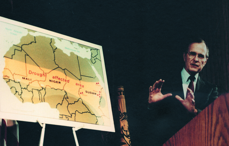
This photograph shows Vice President George H. W. Bush speaking beside a CIA-produced map in 1985, during the Reagan administration.
The map highlights the drought-stricken Sahel region of Africa, stretching across countries such as Mali, Niger, and Sudan.
The shaded band labeled “Drought affected area” refers to the devastating famine and environmental crisis that struck the Sahel during the 1970s and 1980s.
Severe drought, desertification, crop failures, and food shortages caused widespread humanitarian disaster across much of northern Africa. Millions faced displacement and hunger, making the crisis an important international issue during the Cold War era.
Bush’s appearance with the map reflects how CIA cartography was used not only for military and geopolitical analysis, but also for humanitarian and environmental intelligence.
U.S. policymakers increasingly relied on maps to explain global crises involving food security, migration, climate conditions, and political instability. The map simplifies a vast regional problem into a clear visual presentation for public audiences and government officials.
The style of the map is typical of public-facing CIA graphics from the 1980s: large labels, bold colors, and minimal clutter designed for television cameras and press briefings.
Rather than detailed intelligence markings, the emphasis is on communicating the scale of the drought zone across the African continent.
The image is also notable because Bush had previously served as Director of Central Intelligence in the 1970s, giving him a unique connection to the intelligence community.
By 1985, as vice president, he frequently represented the administration on foreign policy matters.
Historically, the photograph captures a broader shift in Cold War intelligence work, where environmental disasters and humanitarian emergencies became recognized as issues with major geopolitical consequences alongside traditional military conflicts.
Also see: Map Of The Proposed Great Green Wall Of Africa
More Declassified CIA Maps
<a href