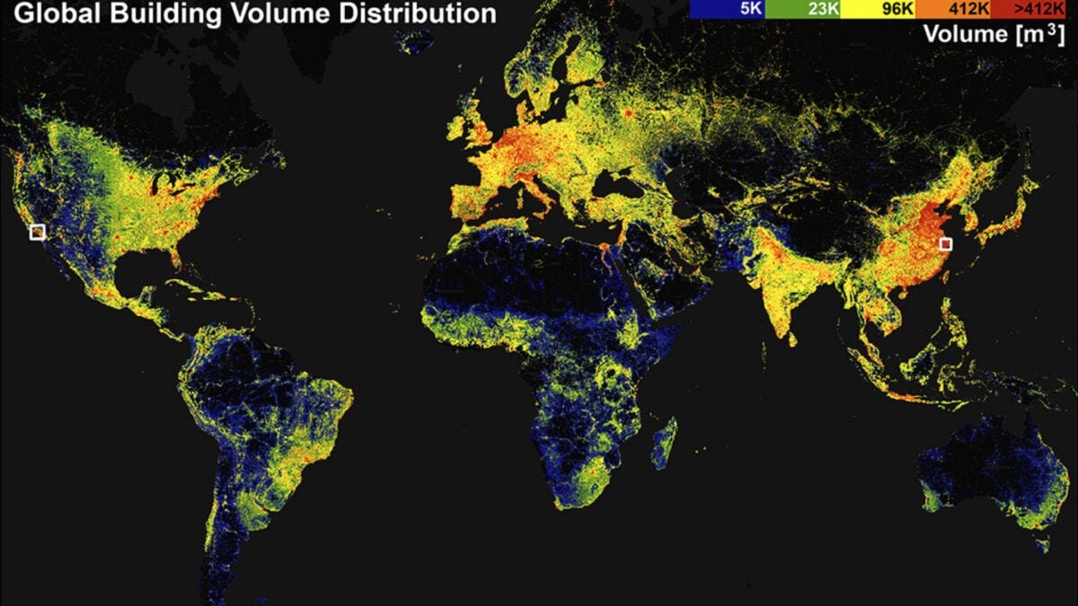
A research team at the Technical University of Munich (TUM) in Germany published the GlobalBuildingAtlas, a high-resolution 3D map of all buildings around the world. The map consists of 2.75 billion building models, which the team collected from satellite images taken since 2019.
This is a huge leap from the previous global dataset, which included about 1.7 billion buildings, and it provides significantly better resolution, about 30 times better than comparable databases, the researchers said in a statement. A detailed description of how the map was created was also published on December 1 in the journal Earth System Science Data.
You can access the interactive map here. There’s also a tab to enter a specific address, which also tells you the location and elevation of the building. Here is the result from Gizmodo’s office in New York:

Alternatively, you can also download the data and code for GlobalBuildingAtlas from GitHub.
Why buildings?
From the satellite data, the team created 3D models of metrics such as the building’s height, volume and position compared to other nearby buildings. All data were also treated with a filtering strategy to account for differences in satellite data quality for some regions.

Apart from being visually appealing, the researchers created this project to serve socio-economic and environmental objectives. For example, such a comprehensive, bird’s eye map provides detailed information about the “footprint” of urbanization and poverty around the world, Xiaoxiang Zhu, lead author of the study and a data scientist at TUM, said in the statement.
To this end, the researchers also took special care to find and include data from areas often omitted in global maps, such as Africa, South America, and rural areas. The dataset also includes a metric known as building volume per capita, or total building mass relative to population. Zhu explained that assessing this metric makes it possible to examine social and economic disparities in certain areas.
buildings on earth
But the team also hopes that mapping urban distribution in this way can inform climate studies. For example, according to the paper, having a good understanding of where and how buildings and populations are located could help improve models on energy demand or carbon emissions.
Already, agencies such as the German Aerospace Center have expressed interest in using the map to evaluate risks from natural and man-made disasters, the researchers said in the statement.
“Buildings support human life and define the form and function of urban environments,” the paper says. “Such 3D insights are essential for urban planning, infrastructure management and policy-making – especially in resource-limited contexts where strategic allocation of funding and interventions is critical.”
Now, for non-scientists and non-politicians who just want to tinker with the map, please do so. The map offers a good range of customizable options for how you want things to look, so definitely dive in and explore.
There are some areas that look dark and devoid of data when you zoom out, but if you scroll to zoom, you’ll actually see that there are 3D models for maybe three or four buildings in the map, even in areas that look empty and isolated. At least, it worked when I typed in the address of a relative of mine in South Korea, who, for better or worse, doesn’t actually live anywhere with endangered water deer — so the map’s coverage is pretty impressive, I’d say.
<a href
