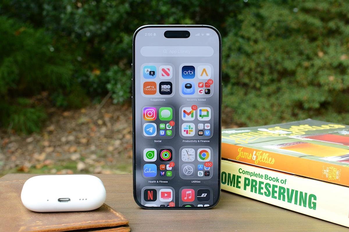
Apple has steadily expanded home screen customization on the iPhone over the past few years, and iOS 26 continues that trend with more visual controls over app icons. Building on the changes introduced in iOS 18, the latest update lets you resize icons, remove app labels, apply a system-wide color tint, and make icons transparent using Apple’s new Liquid Glass design language.
Most of these options live in one place: the Customize menu, which appears after entering edit mode on the home screen. Although iOS still doesn’t allow total freeform icon placement or third-party icon packs without shortcuts, the tools Apple provides are now flexible enough to dramatically change how the iPhone looks and feels. This guide explains how to customize app icons and layout using the options available in iOS 26, focusing on icon size, color, appearance, and arrangement.
How to Customize Your iPhone Home Screen
All home screen customizations start like this.
-
touch and hold an empty area of home screen background until the apps start moving.
-
Tap edit in the upper left corner, then select customize From the menu.
A customization panel appears at the bottom of the screen. Changes made here are not applied on a per-page basis, but to all home screen pages at once.
From the Customize menu, you can:
-
Change appearance (e.g., darker)
-
Make icons transparent with a clean look
-
Add colorful tint to icons and widgets
How to enlarge app icons and remove labels
One of the simplest changes in iOS 26 is one of the most impactful. From customize Menu, tap the icon showing two app squares of different sizes. This switches the home screen to large app icon mode.
When large icons are enabled, app labels disappear completely and the icons themselves expand to fill more of the grid. This creates a cleaner look and makes it easier to tap apps, especially on larger-screen iPhone models. The tradeoff is that fewer icons fit on each screen and the spacing between rows becomes more pronounced.
To return to the standard labeled icon, repeat the steps and tap the same button again.
How to change the appearance of app icons
iOS 26 offers four icon appearance styles: Default, Dark, Clear, and Tinted. These options are available from the top row customize Panel. From the Customize panel, you can tap the sun icon in the All options in the upper left corner to toggle wallpaper dimming. This generally makes app icons and labels easier to read.
default The option keeps the icons as intended by the developers, with no system-wide color or transparency applied.
choose dark Applies dark background to supported app icons and widgets. Apple’s own apps fully support this mode, and some third-party apps do as well, although many retain their original colors. When Dark is enabled, iOS can also dim the wallpaper slightly, which can help reduce power usage on OLED displays.
clear The option enables translucency in all apps on the home screen. This removes all colors but retains the app label. The layered, frosted-glass effect changes depending on the background image. Clear icons can be combined with Light, Dark or Auto styles using the options at the bottom of the Customize panel.
painted The mode allows all supported app icons and widgets to take on the same color scheme. After selecting Tinted, Hue and Saturation sliders appear at the bottom of the screen. Adjusting these changes the color applied to the icons, creating a uniform look that can range from subtle pastel to high-contrast monochrome themes.
If you want a specific color from your iPhone’s wallpaper, select the eyedropper tool, then tap and hold while dragging the cursor across the screen until you reach your chosen color. Like the Clear option, you’ll be able to choose between Light, Dark, or Auto when adjusting tinted settings.
auto The option allows icons to switch between light and dark appearance depending on system-wide light or dark mode.
How to arrange apps around the home screen
App placement works the same as it did before iOS 26, but the visual changes introduced by larger icons and spacing make layout choices more noticeable.
Apps can be rearranged by accessing an empty spot on the Home screen, then tapping and holding until the apps jiggle. From here you can drag the icons to new positions. The grid remains fixed, meaning icons can’t overlap or be placed independently, but there’s more flexibility in how the free space is used.
Icons can be clustered toward the bottom of the screen, aligned to one side, or arranged to frame the wallpaper. With larger icons enabled, the gap between the Dock and the first row of apps becomes more pronounced, but it cannot be filled with additional icons.
The changes apply to all Home screen pages, so rearranging one page doesn’t affect the size or appearance of icons on another page.
Which iOS 26 still doesn’t allow
Despite extended adaptation, some long-term limitations remain. iOS 26 does not support per-app icon color selection, custom icon packs without shortcuts, or freeform icon placement outside the grid. Icon appearance settings apply globally, not per page or per app.
Widgets, lock screen customizations, and focus mode filters add additional layers of personalization, but those tools are outside the scope of the home screen edit menu.
iOS 26 gives iPhone users more control than ever over the look of their home screen, even if Apple’s approach remains structured. By combining icon resizing, appearance modes, and careful app arrangement, it’s possible to create a layout that feels cleaner, more personal, and easier to use without relying on workarounds.
<a href
