What I bring to you today is a real gem that I have been searching for for a long time and I have finally found a copy of itIt is a collection of 672 maps found in The Great Korean EncyclopediaReference Encyclopedia of North Korea. More specifically, it is an electronic version published on CD in the first decade of the 2000s.,
Work on this encyclopedia began in 1964, when Kim Il Sung established a compilation committee with the aim of bringing together all the knowledge and guidelines that a good Korean should follow.The work lasted several decades, and the result was published in thirty volumes between 1995 and 2002, The encyclopedia contained over 100,000 words, 25,000 images and photographs, and 5,200 historical figures,
And maps, lots of maps.
According to the popular narrative in North Korea, the war was won by the Communists and since then, the entire Korean Peninsula has been united under the rule of the Korean Workers’ Party. Therefore, when looking at the maps in this atlas, it should come as no surprise that Korea is always shown as a single country, with no reference to the other country at the southern tip of the peninsula.
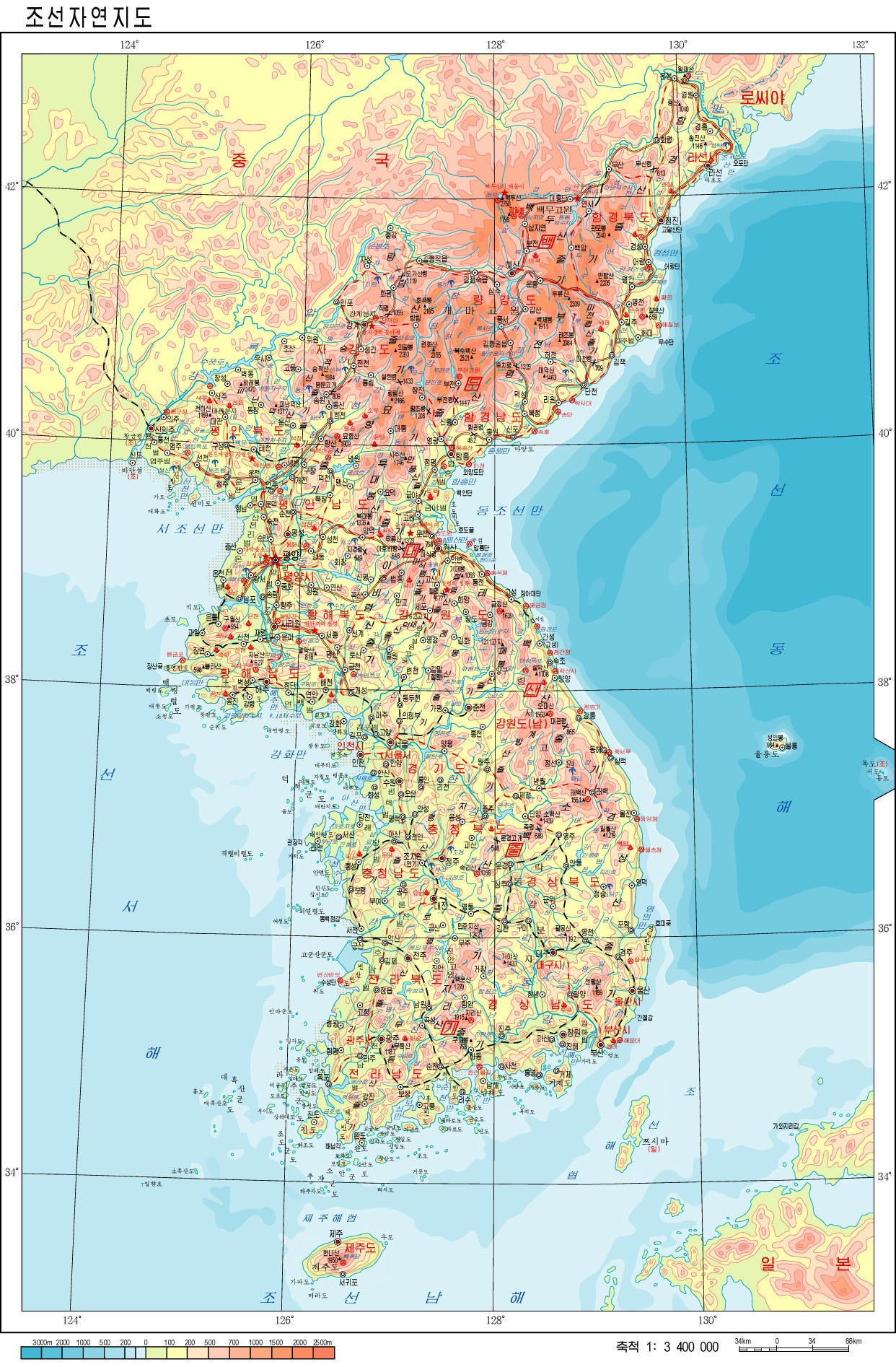
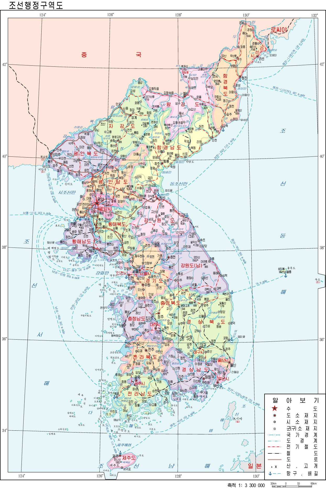
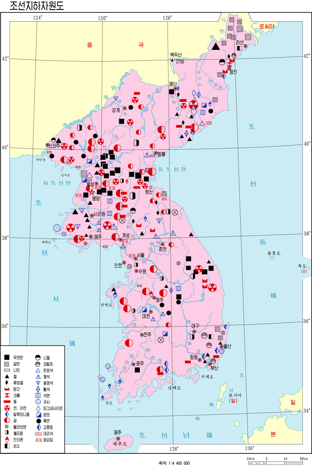
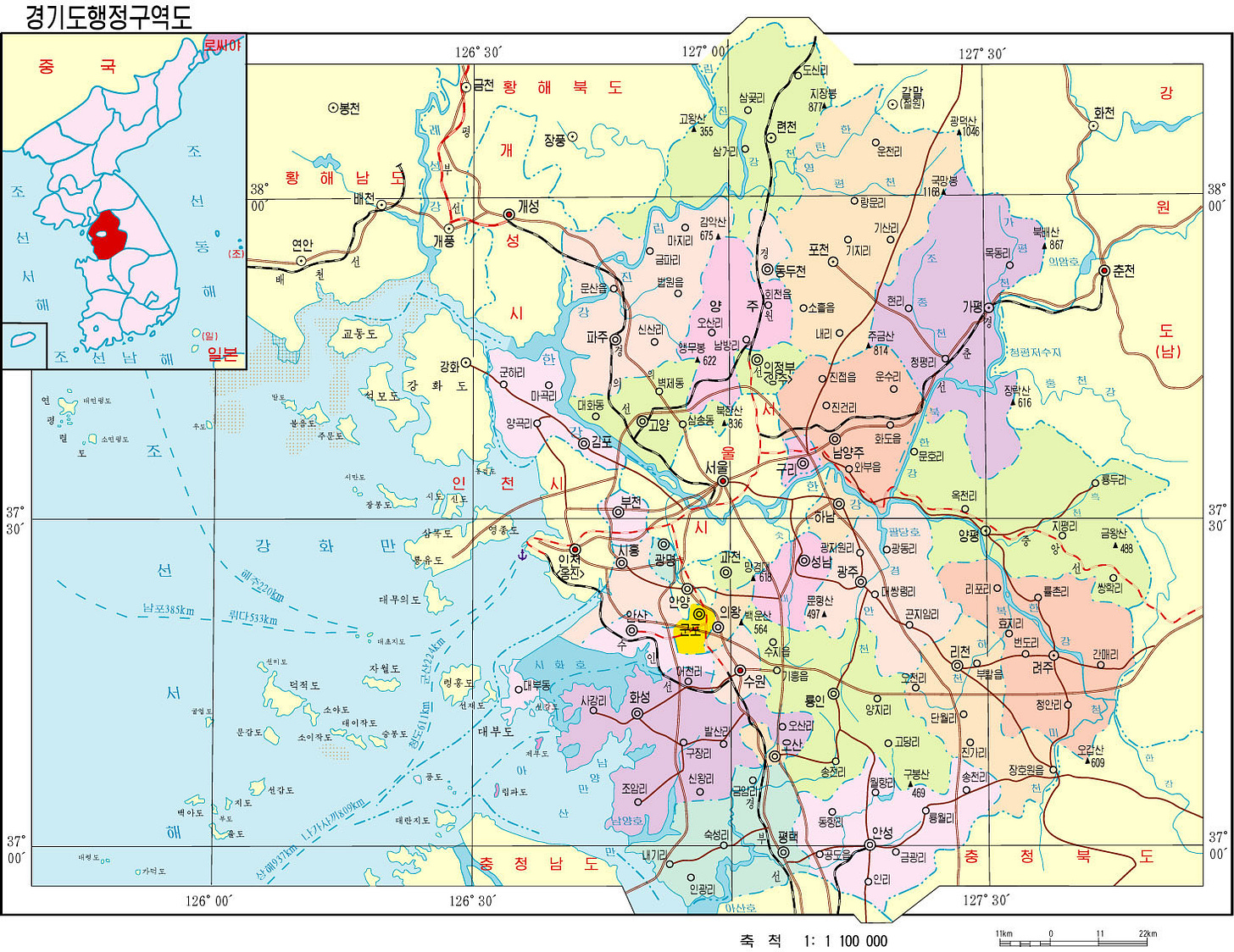
In addition to general maps of Korea, like any good atlas, the encyclopedia also includes detailed maps of each province and county that makes them up. Again, it makes no distinction between North and South while maintaining the narrative of unity.
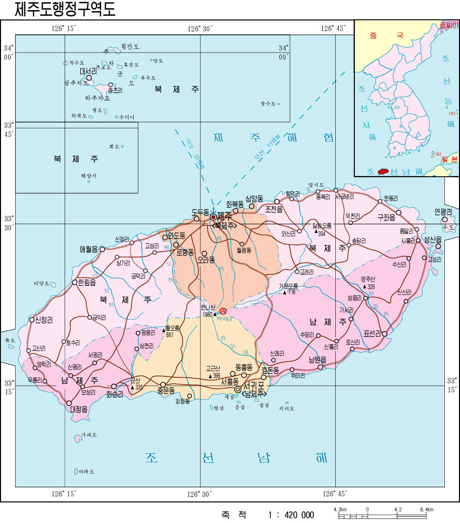
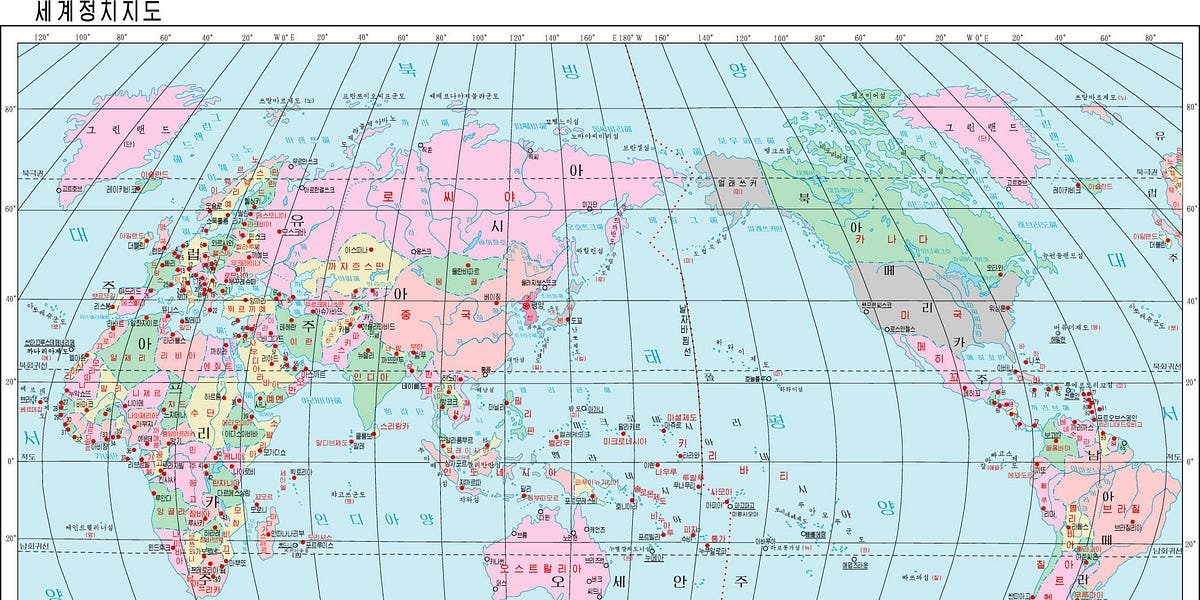
When we delve into the global view of North Korean cartography, things get even more interesting. So I’ll just start with the world map.
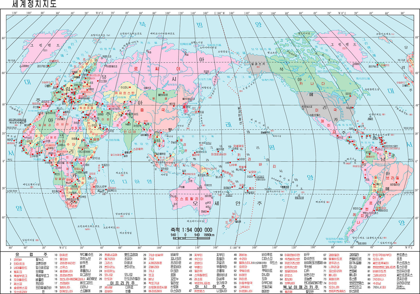
This world map of North Korea focuses on the Pacific Ocean, giving Korea a privileged position on the global stage. This is nothing new, but what is new is how North Korea portrays its enemies. Can you recognize them?
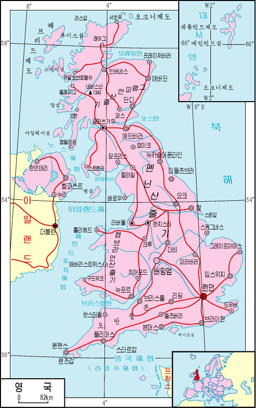
Yes, those are the only two countries colored dark gray: the United States and Japan. This pattern can also be seen on the political map of KoreaAnd is consistent on almost all political maps in the atlas. In the map of Europe, which you can see below, this color is also used for the United Kingdom and France, but in this case, it does not correspond to all political maps.
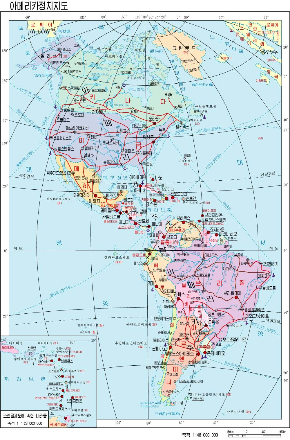
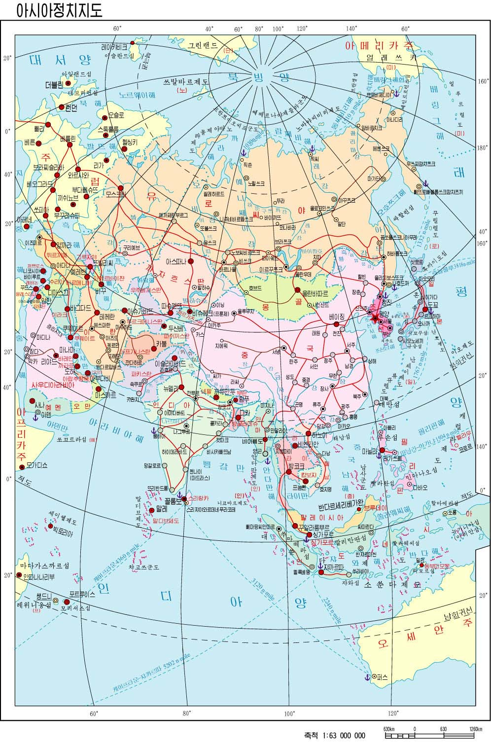
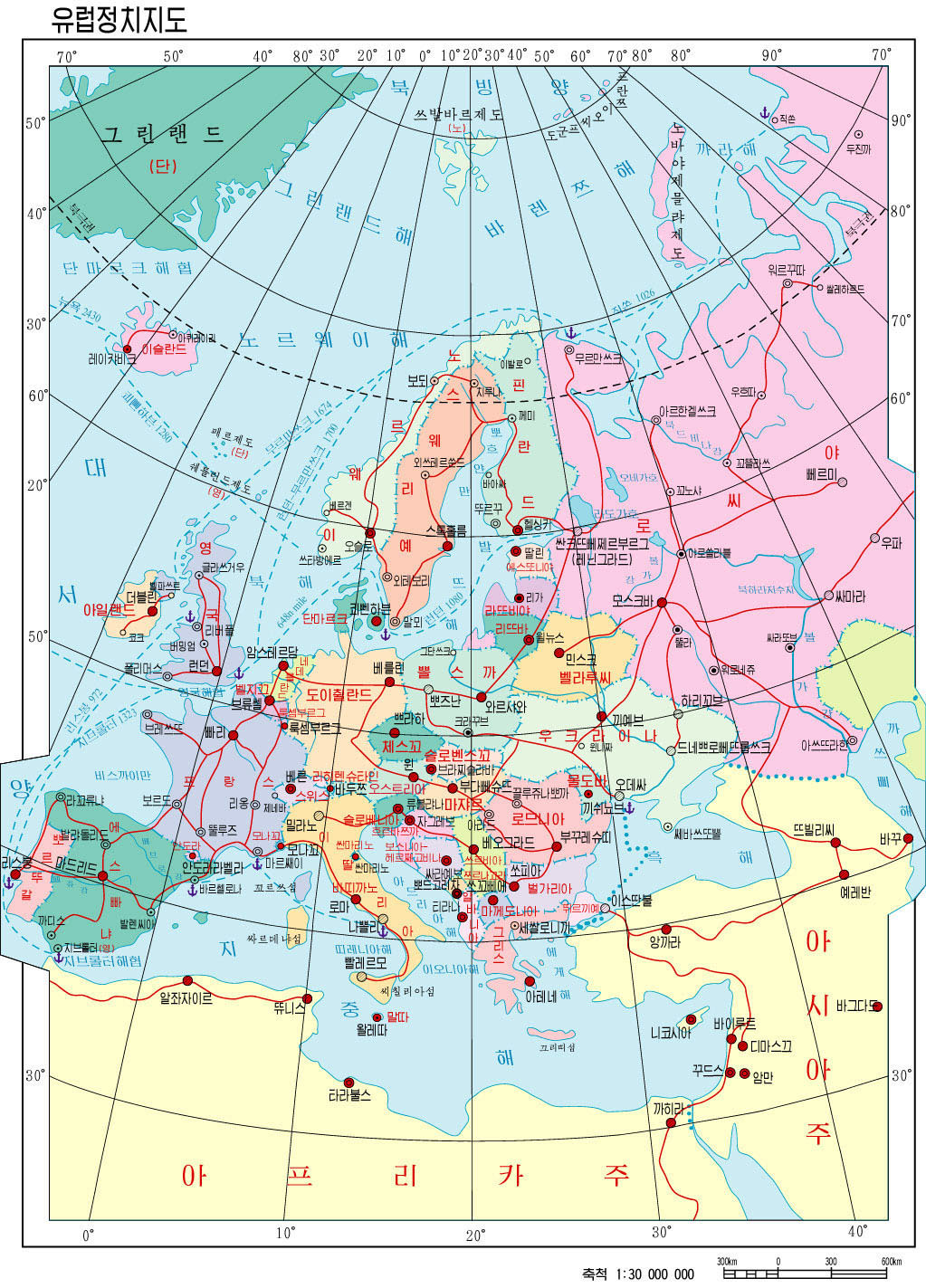
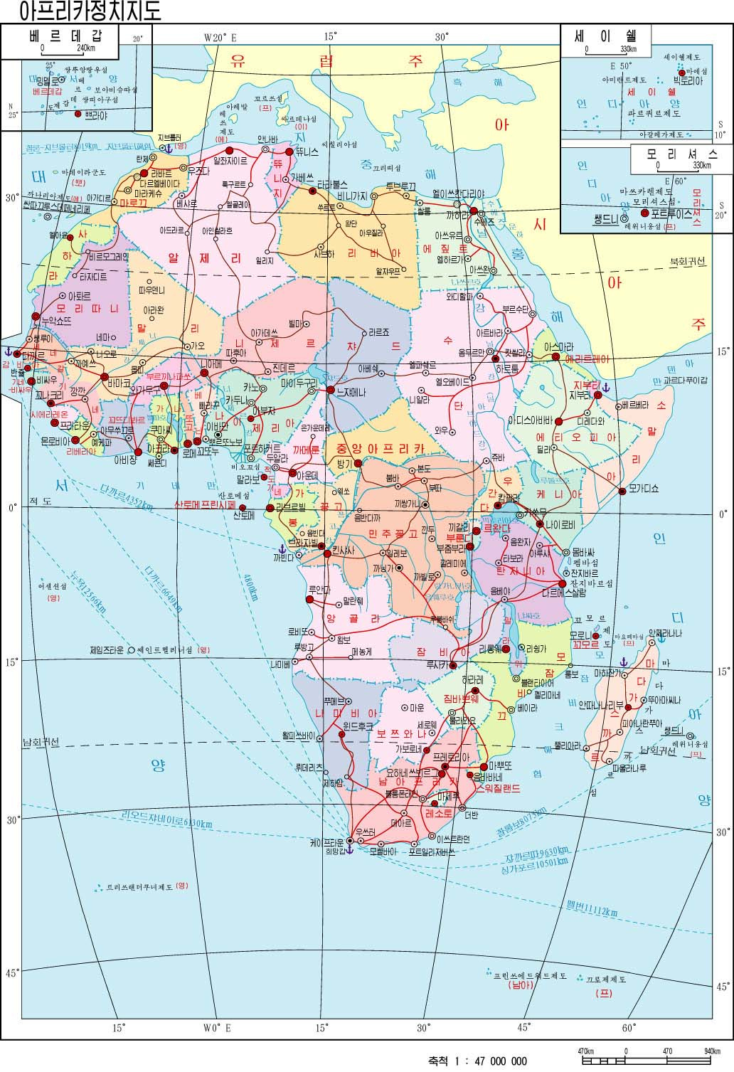
The representation of continents is also somewhat interesting. Besides the idea of showing enemies in a uniform color, I like the choice of projections. Instead of choosing the classic projections seen in Western cartography, the authors of these maps choose projections that better balance the shapes and sizes of different countries. They take advantage of the fact that only one region of the world needs to be represented.
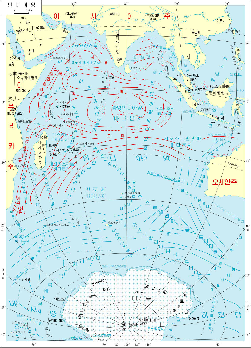
The encyclopedia also includes maps of all the oceans, including ocean current patterns.
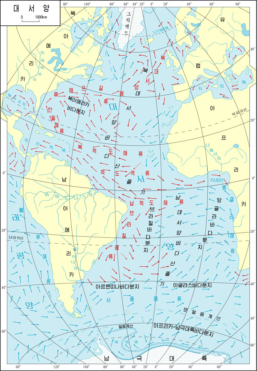
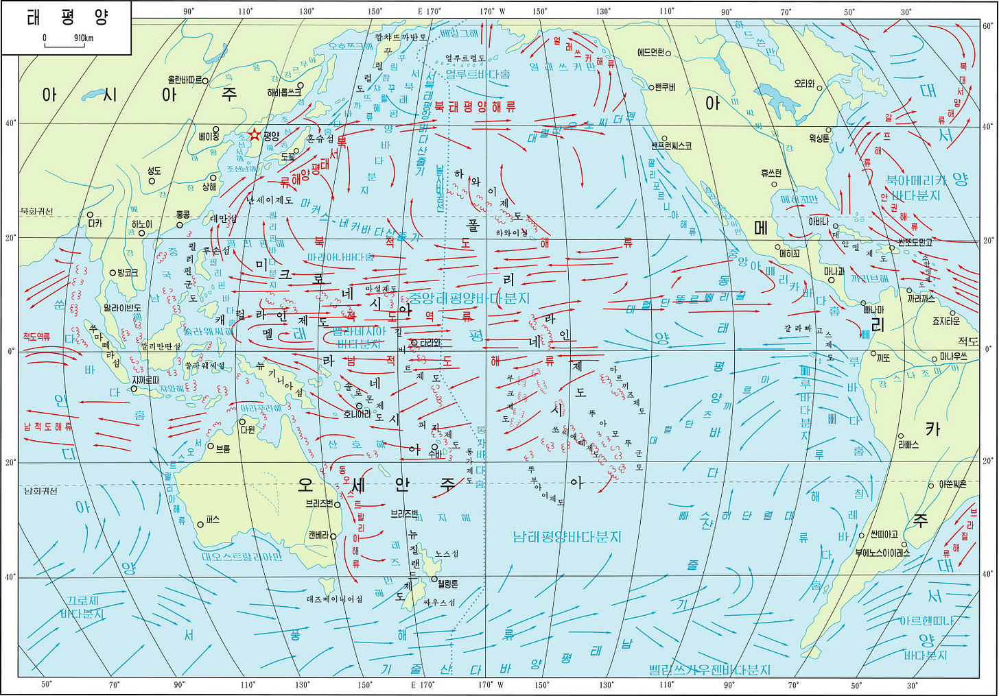
This collection would not be complete without maps of the country. Here, once again, we emphasize the geopolitical situation and North Korea’s approach to the world. This is consistent with the political maps of each continent, but when viewed separately, it is even more apparent.
First, the map dedicated to enemies.
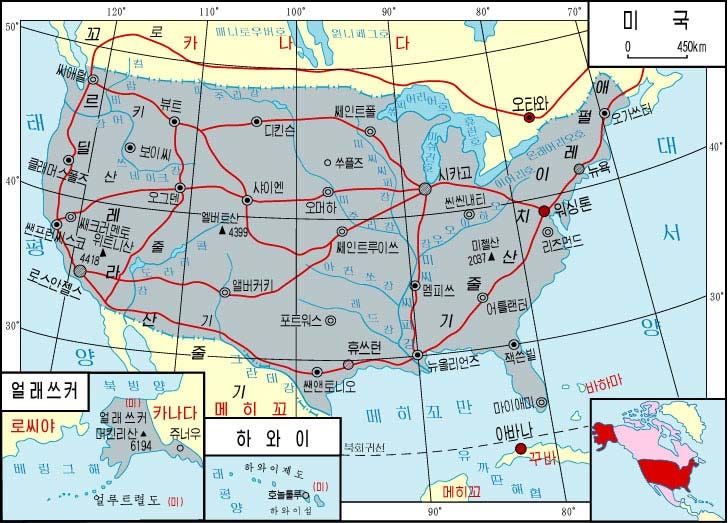
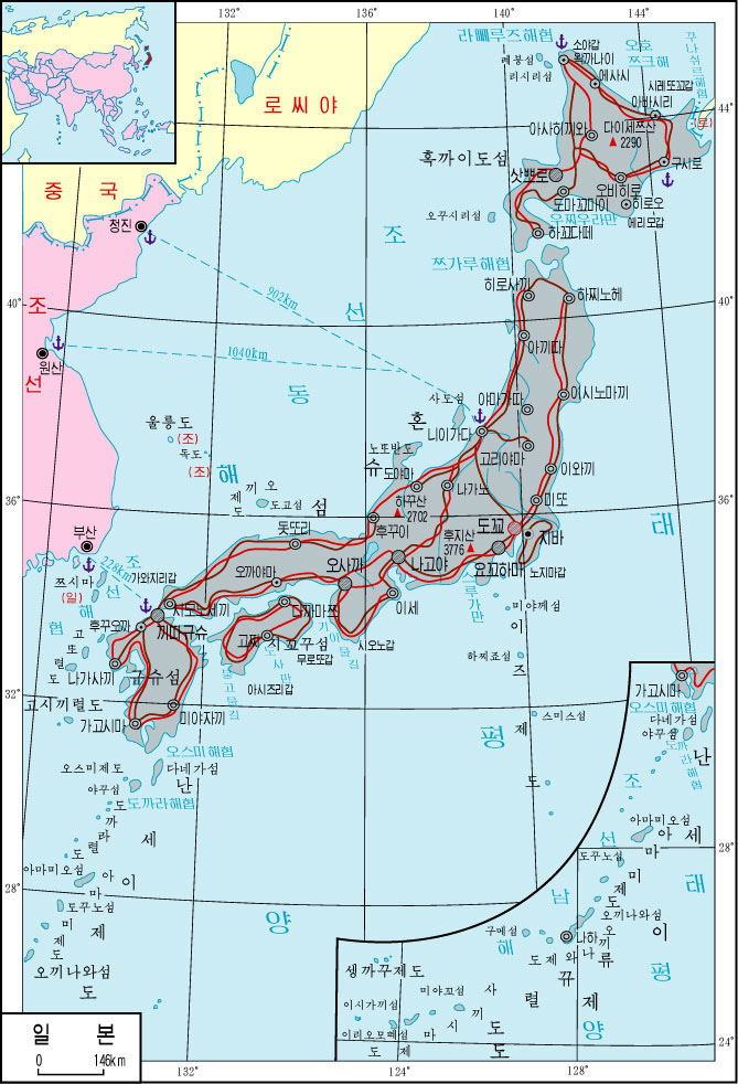
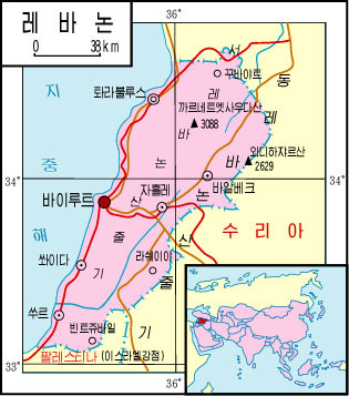
Apart from these obvious things, there are more subtle issues which can be understood by looking at the complete list. Israel is the only country that does not have a dedicated map. In fact, Israel does not appear under that name on any map, but the territory of Israel appears as Palestine on maps of Asia and all maps of surrounding countries. In the one for Jordan, it is also made clear that Palestine is Israeli-occupied territory.
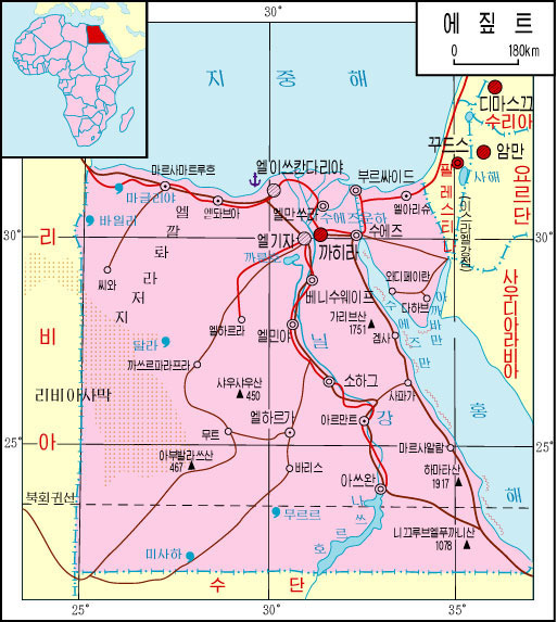
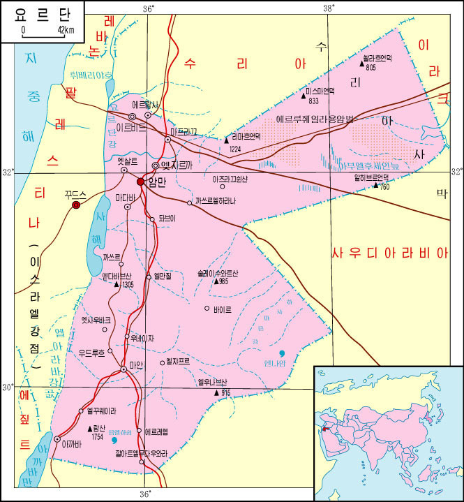
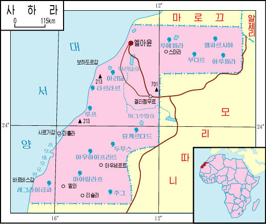
Another interesting point is that the atlas also includes countries with limited international recognition: Sahrawi Arab Democratic Republic of Western Sahara.
And well, although it may not be of general interest, since most readers are from countries with large English populations, here you can see how some of these countries are represented.
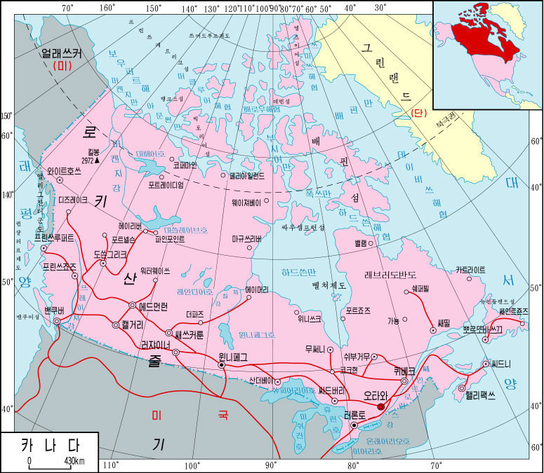
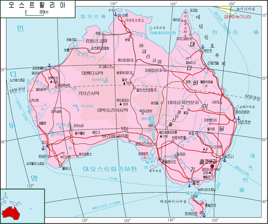
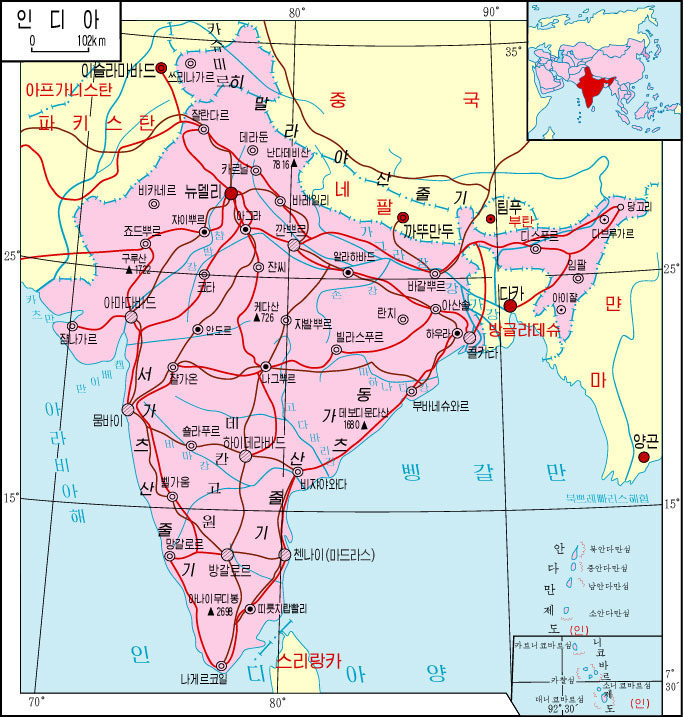
If you are interested in another map, please let me know in the comments and I can update the article.
Acknowledgment: I am completely grateful for today’s article pedro zuritathe man behind Mapoteca de PZZThanks to whom I obtained a copy of this magnificent atlas. I suggest you follow him InstagramWhere he posts many maps, especially of Mexico, etc. tiktok Or youtubeWhere he posts interesting videos on cartography and geography (in Spanish).
Эта статья полна интересного контента, который побудит вас исследовать новые горизонты. Мы собрали полезные факты и удивительные истории, которые обогащают ваше понимание темы. Читайте, погружайтесь в детали и наслаждайтесь процессом изучения!
Узнать больше – https://vivod-iz-zapoya-2.ru/
Тендерный специалист помогает разобраться в особенностях каждого закона, а также обеспечивает грамотное сопровождение всех процедур. Это особенно важно для компаний, которые только начинают участвовать в торгах и не имеют опыта работы с государственными контрактами.
Полный разбор — только здесь – комплексное тендерное сопровождение ростов на дону